
About SeekaKey
Your place,your pace.
We help renters and apartment owners connect with more confidence. SeekaKey brings clearer listings, verified profiles, and calmer communication into the rental process.
SeekaKey is built for people making real housing decisions. Renters need clarity and control. Apartment owners need trust and serious leads. Our brand exists to make both sides feel informed, respected, and ready for the next step.
01 / Logo
The mark
The SeekaKey mark turns a house key into a symbol of access, clarity, and home. The key teeth echo the pillars of a house, while the rounded wordmark keeps the identity soft, approachable, and easy to recognize.
Primary
Our main logo on light backgrounds
Reversed
The logo for navy or dark surfaces
Icon only
The rounded-square mark for compact placements
Clearspace
We keep enough space around the logo so it stays easy to recognize wherever customers see it.
Minimum size
The logo should always be large enough to read clearly on phones, listing pages, documents, and partner materials.
Don't alter
The logo stays consistent so renters and owners can recognize SeekaKey across every touchpoint.
02 / Colors
The palette
Our colors are chosen to make rental decisions feel clearer and less stressful. Navy brings trust, coral adds warmth, and soft neutrals keep listings and profile information easy to read.
Primary
Navy Blue
#003865
Trust, reliability, security, professionalism.
Accent
Coral
#F26B63
Friendliness, energy, human connection, engagement.
Neutrals
Soft Gray / Off-White
#F5F5F5 / #F4F5F5
Clarity, readability, calm, modern aesthetic.
03 / Typography
Type that feels approachable
Our typography is built for clarity. Headings feel warm and confident, while body text keeps rental details, profile information, and next steps easy to scan.
Headings
DM Sans
Rounded geometric fallback
Body
Open Sans
Readable, neutral, trustworthy
Display
Your place,
DM Sans Bold · 72 px
Heading large
The mark
DM Sans Bold · 48 px
Heading medium
The palette
DM Sans Bold · 30 px
Body
Body copy should be set in Open Sans at 16–18 px with a comfortable line height. Keep paragraphs short and left-aligned for the calmest reading experience.
Open Sans Regular · 18 px
04 / Imagery
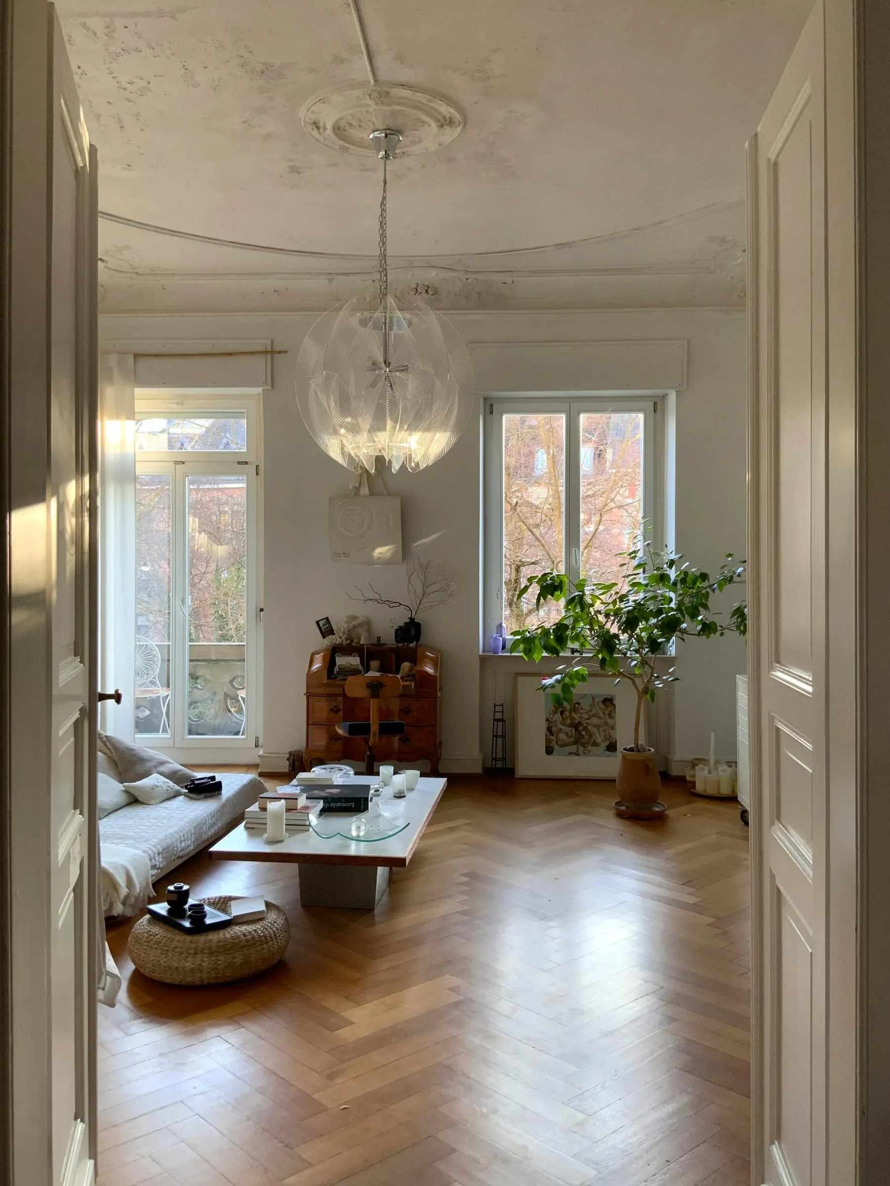
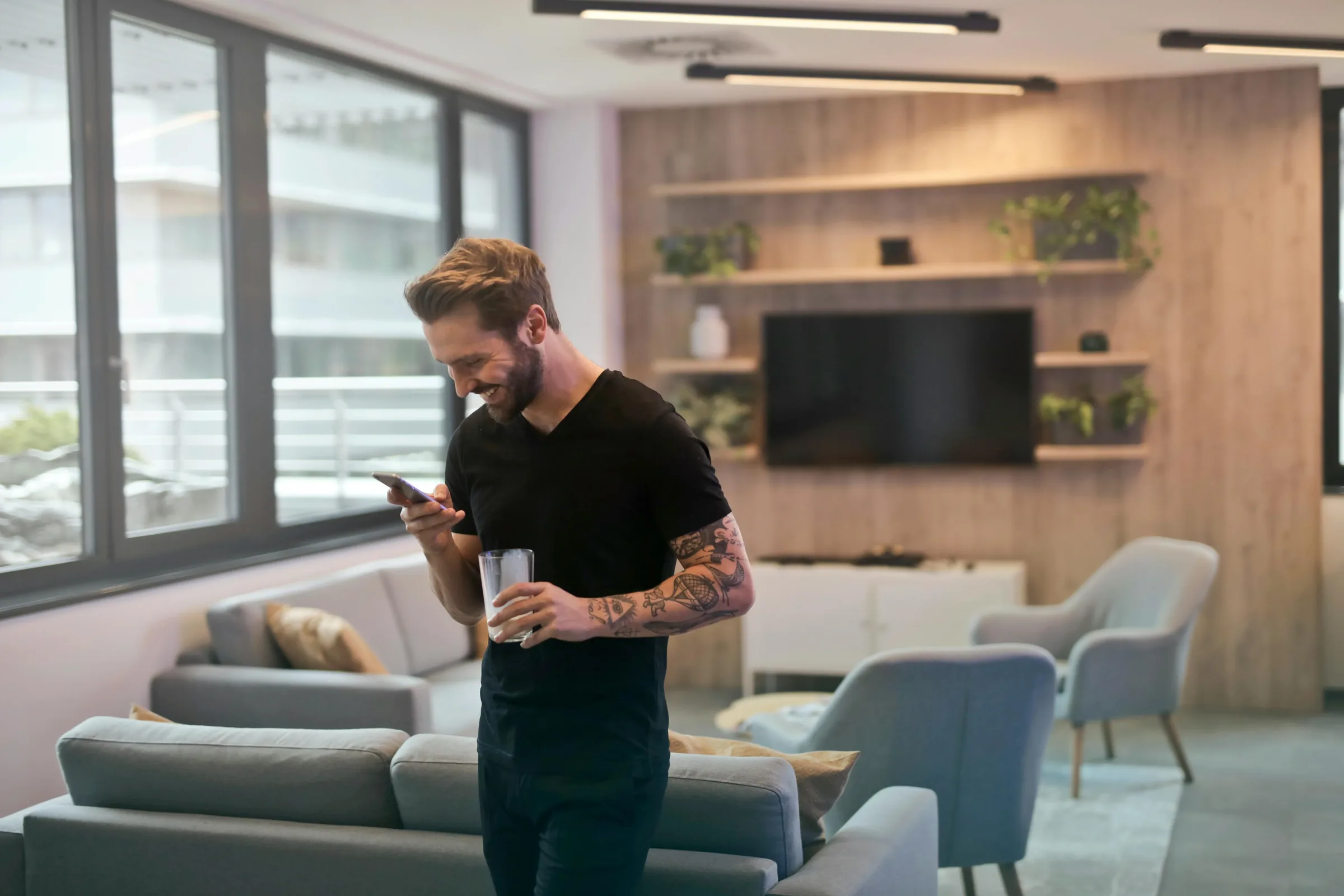
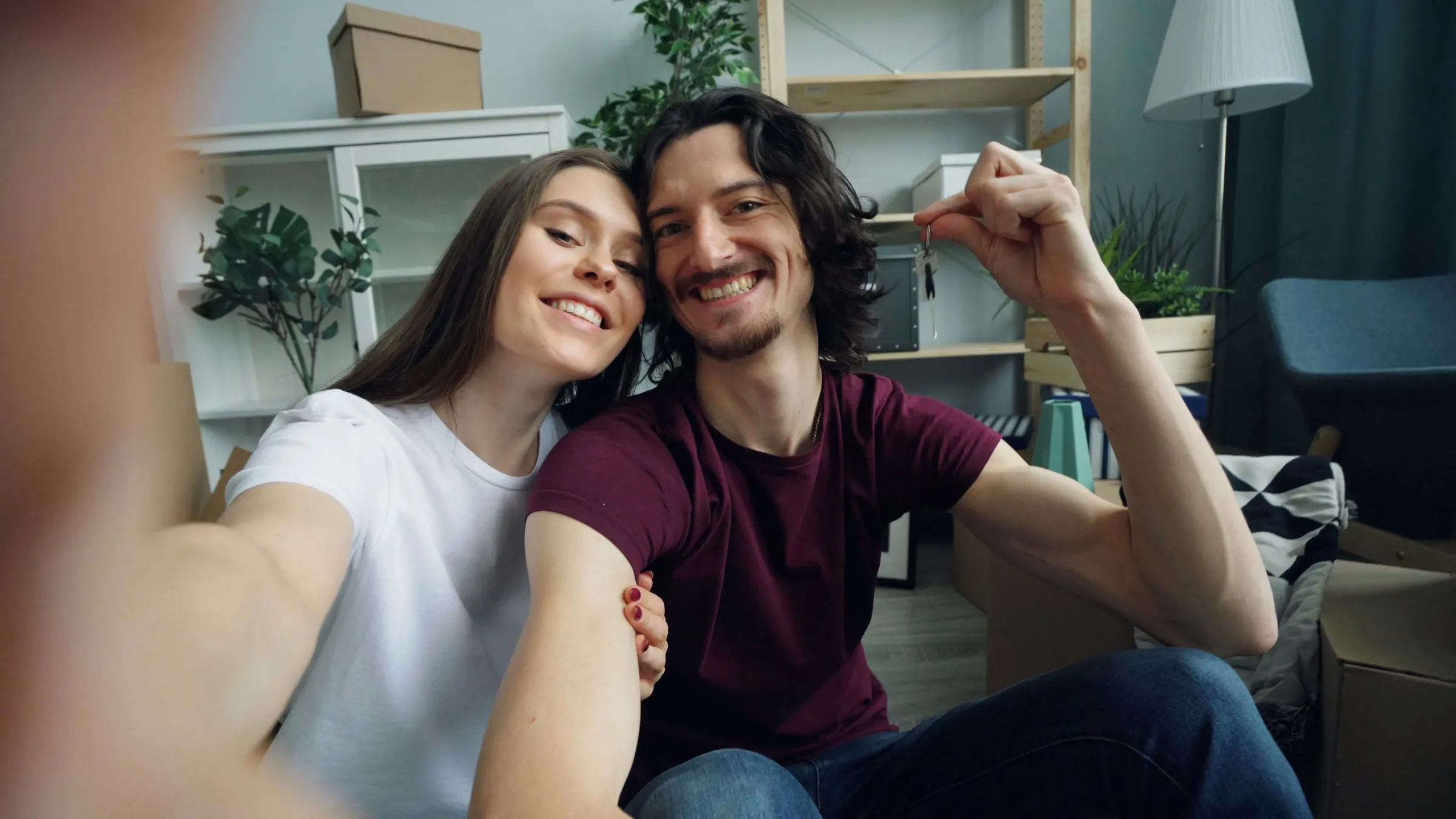
Real homes, real people
Our imagery shows real homes, real people, and practical moments. Customers should see spaces they can understand and a rental experience that feels approachable.
Imagery principles
- Natural light and candid moments
- Warm, soft color grading
- Clean but lived-in spaces
- Diverse, genuine people
05 / Voice
Clear, helpful, and calm
We say
"Your place, your pace. Build one profile and take the next step when you are ready."
We don't say
"Complete your renter application now before this unit is gone."
Human
We speak to renters and owners like people making important decisions.
Reliable
We explain what happens next so both sides can move forward with confidence.
Modern
We keep the experience modern, useful, and easy to understand.
Calm
We reduce urgency and noise so people can act when they are ready.
06 / Assets
SeekaKey logo assets
For press, partner, or owner communications, use these approved SeekaKey logo files so the brand stays consistent.